How to choose a paint color for the interior? Rules for combining shades and trends 2025
Let's analyze the basic rules for choosing colors to create a spectacular design, as well as consider current trends for 2025.

Choosing a color scheme for an interior is one of the key stages in creating a stylish and harmonious design. The color of the walls affects not only the aesthetics of the room, but also the mood and emotions we experience while in the room.
We choose the color of the walls depending on the type of room
Has it ever happened that upon entering the house you immediately feel lightness and harmony? Such a feeling arises thanks to the successful selection of the color range. The art of color combination is crucial in creating an inspiring home. Here it is important to take into account many details and one of them is the purpose of the room.
Cozy living room
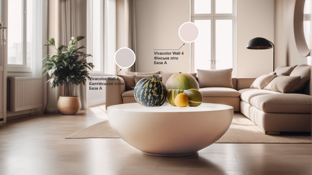
It is important to create a warm atmosphere in the living room, because it is a place where we relax with our family, and also receive friends and acquaintances. Warm, neutral colors such as cocoa with milk, Finnish summer, Baltic beach or dry clay are ideal for this room. These colors add a feeling of coziness to the interior, and are also suitable for both classic and modern styles.

Want something more intense? Look for shades of blue or green, such as lime pudding or Finnish blue. Such color solutions will add zest to the design, while they create a rather calm atmosphere.
.jpg)
Comfortable bedroom
The bedroom is a place of strength for every person, and the main place of rest, so the atmosphere here should be appropriate. In the bedroom, the best solution will be soft, soothing colors, such as curdled milk, dry mustard or polar moss. These shades create coziness and help you relax as much as possible. We also advise you to avoid too bright colors - bright red, coral or fuchsia, as they can overly excite the nervous system and interfere with rest.
.jpg)
A convenient office
To create a comfortable working space, choose colors that will promote concentration. Yes, shades of blue stimulate mental activity and reduce stress. The use of neutral colors, such as the Baltic or a dry slope, form a calm background that will not distract from work. For dynamics, you can add accent details, for example, sunny yellow or a shade of the Scandinavian forest.
.jpg)
Functional kitchen
The kitchen is often used not only as a place for cooking, but also as a dining room, so colors that improve mood and add energy will be appropriate here. Choose from different shades of green, yellow, beige and brown. They create a comfortable atmosphere and add lightness to the space.
.jpg)
If you are a fan of minimalism, try combining white or gray with bright accents, for example, deep green or red. The main thing is that the colors should be balanced and should not overload the space.

Comfortable bathroom
It is important to create an atmosphere of comfort, freshness and cleanliness in the bathroom. Here, light, cold shades will be the ideal solution: sky blue, light gray, frosty mint. Such color solutions will help visually expand the space and add lightness to it.
Looking for non-standard solutions? Try rich blues, deep green shades and even black and gray, which will create a feeling of luxury.
Cute children's room
It is generally accepted that children's clothes are always bright pictures and flashy shades, but this is not always the best solution. Firstly, all children are different, so not every little one will like it, and secondly, too saturated colors can irritate the nervous system. An alternative can be pastel shades of blue, pink, green and beige. And to create a real paradise for a child, use children's decor - paintings, furniture, carpets, lamps, toys.
.jpg)
TOP-3 rules for choosing paint color
Choosing the color range of the interior is an important stage in creating an interior design. When choosing colors, it is important to take into account not only your own preferences, but also the basic rules of coloristics.
№1. Selection of samples
When choosing colors for wall painting, we recommend looking at paint samples under different lighting. It is important to see how the color looks both under natural and artificial light, because this factor significantly affects its perception.
№2. Room dimensions
When choosing shades, also take into account the dimensions of the room, it is very important to maintain a balance here. In small rooms, it is better to use light colors that visually expand the space.
Do you want to add coziness to the room? Pay attention to dark, muted tones. The room will definitely become more comfortable, but visually it may look smaller. If you want to use a dark color in a small room, consider using an accent wall.

№3. Consider the degree of gloss
The paint can have a different finish gloss: matte, semi-glossy, glossy. Matte paints create a soft, elegant look, but sometimes they are less practical for areas with increased pollution. The exception is paints with a high level of resistance to wet abrasion.
Glossy surfaces perfectly reflect light and are easy to clean, making them a great solution for kitchens and bathrooms.
Basic color combination schemes
One of the secrets of successful interior design is the harmonious combination of shades in the room. Let's look at the 3 most popular color combination schemes.
№1. Monochrome
Monochrome color combinations are a classic of minimalist designs. This approach involves the use of the same color within the space, but in different shades. It is an ideal option for those who want to create a modern and elegant design. An example of such a solution is a combination of light green and dark green shades, for example, Finnish fern and Finnish forest.
.jpg)
№2. The game of contrasts
Contrast schemes combine shades that are in the center of an isosceles triangle on the color wheel, for example, yellow + blue. Such combinations create a dynamic and lively interior. Here it is very important to maintain a balance so that the design is not overloaded.
№3. Companion colors
Companion colors are shades that are harmoniously combined with each other. They are opposite on the color wheel. For example, yellow and purple or turquoise and yellow-hot and others. We recommend using no more than three colors in such a scheme so that the space looks light.
Trend colors in interior design for 2025
The new year is already shining on the horizon, so it's time to think about what trends are waiting for us. In 2025, warm natural colors and rich, deep shades will become relevant.
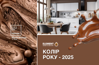
- Environmental friendliness and lightness. The modern rhythm of life forces us to run faster and farther away from nature. That is why one of the trends will be naturalness. Accents on texture and natural materials — wood, stone, marble — will be the key design elements. Look out for shades like Finnish field, wet sand, warm brown, Scandinavian grasses and terracotta.
- Scandinavian minimalism. Classic minimalism goes a little to the side, instead its place is taken by more cozy and comfortable Scandinavian minimalism. Simplicity, comfort and naturalness reign here. Blue, pink, mint, peach and milky white colors will fit perfectly here.
- Creative approach. Pandemic, war... all this has put us in a certain framework, from which we really want to get out. And creativity is one of the ways that will help in this. To add a creative note to the interior, pay attention to such shades as dark blue, emerald, burgundy.
.jpg)
Choosing a color scheme for the interior is one of the most important stages that will help shape the mood in the home. Take into account the functionality of the room, the rules for combining colors and current trends. But most importantly, to create the interior of your dreams, start from your own vision and taste. And we will help you paint everything the way you want. Choose Vivacolor paints on the epicentrk.ua website and create the perfect home!


